Why Most B2B One-Pagers Fail Before They're Read
The B2B one-pager occupies a specific moment in the deal: the buyer takes it from the meeting, or the rep sends it as a follow-up, and it either earns a second look or it goes into the folder where all the other vendor PDFs go to be forgotten. Which of those happens is largely determined in the first three seconds of the reader opening it — before a single sentence is read.
Those three seconds are visual. The reader is scanning: does this look like it's for me, does it look like it was made with care, does the visual hierarchy tell me immediately where to look? Most B2B one-pagers fail this test. They're dense, they have five competing visual zones, they lead with the company logo at maximum size and then immediately pivot to a bullet list of product features. The design is saying "here is information about us," when the reader's brain is asking "does this have anything to do with my problem?"
This is a design brief problem as much as it's a design execution problem. A one-pager brief that instructs the designer to include: company overview, three product pillars, a feature list, two testimonial quotes, a logo cloud, and a footer with contact information — that brief has built the failure into the design before anything has been created. You cannot design a focused, readable one-pager from a brief that has eight required content zones for a single page.
The Hierarchy Principle
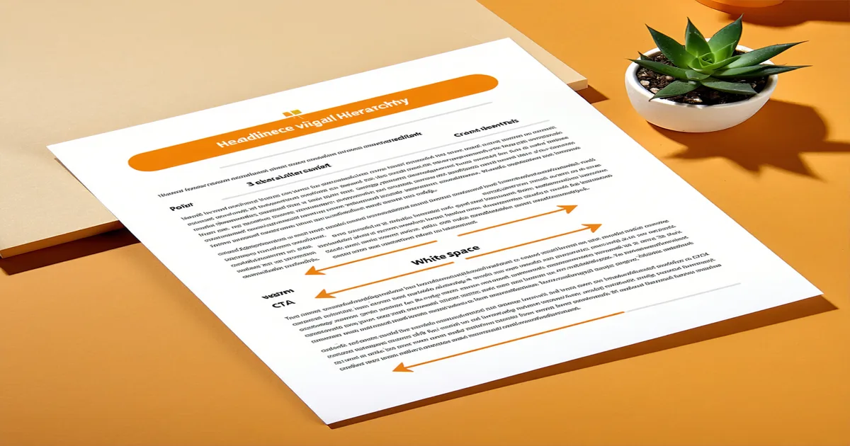
Every element on a one-pager competes for attention. The design principle that separates effective one-pagers from information dumps is explicit hierarchy: a deliberate decision about what the reader sees first, second, and third — and a corresponding visual weight assigned to each tier.
Tier 1 — the thing the reader sees first — should be the problem, not the solution. Not your company name in 48pt type. The reader's problem, stated specifically enough that they recognize it as their own. A one-pager for a B2B content operations platform that opens with "Content teams waste 40% of production time on revision cycles caused by unclear briefs" is addressing the reader before it's selling the product. The reader who has that problem reads the next line. The reader who doesn't have that problem self-selects out, which is efficient.
Tier 2 — the solution — should be a crisp articulation of the approach, not a feature list. Not "our platform includes brief intake, voice guide engine, multi-format output, and review workflow." Instead: "Contentaxle makes the brief the center of the workflow — every output is constrained by your spec, not a generic prompt." One sentence that captures the approach. The features are tier-3 detail; they should exist, but they're for the reader who has already been captured by the argument.
Tier 3 — supporting evidence — is where the testimonial quote, the statistic, or the outcome claim goes. This is the content that converts a reader who's nodding along into a reader who books a call. One strong, specific proof point outperforms three generic ones. "Marketing team at a B2B analytics company reduced brief-to-draft cycle from 12 days to 3" lands harder than three different quotes about being "game-changing."
White Space as a Signal
The most counterintuitive design principle in B2B one-pager design is this: the amount of white space on the page correlates with how confident the brand is in what it's saying. Brands that don't trust their argument try to fill every inch. Brands that trust their argument leave room to breathe.
White space does several things technically: it creates visual groupings that help the eye understand which elements belong together, it reduces the cognitive load of reading by separating one thought from the next, and it gives the reader's eye a resting point before the next zone of content. But it does something strategic, too: it signals that the brand isn't trying to overwhelm you with information. It's saying three specific things clearly, and it trusts that those three things are compelling enough.
A practical test: print the one-pager in grayscale and squint at it from arm's length. Can you see three to four distinct content zones? Is there visible white space between them? Are some zones clearly larger or heavier than others, giving the reader a natural reading path? If all the content zones blur together into an even gray mass, the hierarchy has failed.
Typography and Scannability
B2B one-pagers are often read in scan mode: the reader moves through in 15–30 seconds before deciding whether to engage more deeply. Design for the scan, not for the slow read. Every piece of body text should be accessible to a reader who reads only the headings and subheadings. If removing all the body text makes the one-pager's argument incomprehensible, the headings are not doing their job.
Two typography principles specific to one-pager format:
First: limit the typeface count. A one-pager that uses three typefaces in six weights is a one-pager that can't decide what it is. One display font for headlines, one text font for body, consistent weights throughout. The visual discipline signals brand confidence. Typography variety in a one-pager context reads as design chaos, not personality.
Second: set the body text for reading, not for fitting. The impulse when content doesn't fit is to reduce the font size to 8pt and shrink the line height. The result is text that requires active squinting and therefore doesn't get read. The correct response to content overflow is to cut the content, not the font size. If the copy doesn't fit at 10–11pt with comfortable line height, the brief specified too much content for the format.
Format Variants and When to Use Them
Not every one-pager serves the same deal moment, and the structural template should vary accordingly. Three common variants:
The leave-behind one-pager is designed to be read after a demo or meeting, without the rep present. It needs to stand alone — the reader has context from the meeting, but they need to be able to reconstruct the argument without anyone to explain it. This version can afford slightly more detail in the solution and evidence sections because the reader is motivated.
The cold-reach one-pager is designed for prospects who have no prior context. It needs to earn attention from zero, which means the problem framing has to work harder and the solution section needs to be shorter. The ask at the bottom should be a low-commitment next step — "15-minute conversation," not "request a demo."
The decision-stage one-pager is for buyers who are actively evaluating and need to make a comparison. It can include a brief competitive positioning section (in factual, non-disparaging language) and a more detailed proof point or ROI framing. This version is designed to be forwarded to an economic buyer who wasn't in the initial evaluation — it needs to be self-explanatory to someone with no prior exposure.
We are not saying every company needs three separate one-pager templates in production simultaneously. We are saying that treating one-pager design as a single-template problem — when the deal moments are fundamentally different — is why reps end up improvising the version that doesn't exist when they need it. Start with the leave-behind. Build the others when the deal data shows where reps are lacking the right asset.
The Update Cycle
A one-pager built for a product version from eight months ago is not just outdated — it's a risk. If the rep sends it to a prospect who then asks a question based on something in the document that's no longer accurate, the error undermines trust in the rep's product knowledge and, by extension, the company's reliability.
One-pagers should be versioned and dated. The rep should know they're working from the current version. The review trigger should be attached to product releases, pricing changes, and any shift in the competitive landscape that affects the positioning. This is an operations problem, not a design problem — but it's one that kills the value of good one-pager design faster than almost any design mistake.